
The Shape of Data: Overcoming different data structures

Like many tales of woe, it started with just a bullet point on a list of subtasks of a small project: “Import solid and blood cancer data”.
The project was to develop tools to help researchers analyse the frequency of different genetic mutations in different kinds of cancers, for the highly laudable goal of developing new treatments for cancer - a project that would directly save lives. The source data was being prepared by two teams of researchers, one looking at solid tumour cancers and the other looking at blood cancers (generally known to us lay people as “leukaemia”), but we were assured the data would be in the same format: for every combination of a particular genetic variant and a particular kind of cancer that variant was found in, the data would provide a count of how many times that combination had been found in the study. We would just need to stick the two tables together into a single dataset for the tool to query.

The solid tumour data came first. As usual, it was an Excel spreadsheet sent to us via Slack. As predicted, there was a column for the cancer type, a few columns describing the mutation, and a count. This was great, as this was the easiest format for the software to query; the user picked a cancer type and entered a filter for mutations, and we could just scan the table to find matching rows to assemble into a response. We quickly put together a prototype, and eagerly awaited the blood cancer data to add in - which should just take a few minutes.
Our hopes were dashed on the cruel rocks of fate
But when the blood cancer data came, it was in a completely different format.
Not in the kinds of ways you might expect - there were a few small differences in how the generic variations were expressed, that our code could handle with a few lines changed; but the real problem we faced was much deeper.
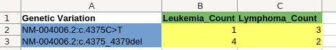
It was, of course, another Excel spreadsheet sent via Slack, and while it had the same columns describing a genetic variants much like in the solid data, there was a separate column for each type of blood cancer; the counts were organised into a two-dimensional grid, with one row per mutation and one column per cancer type. We couldn’t just append it to the solid cancer data, and we didn’t want to have two separate tables with different structures in our database with different code to query the two kinds of cancers; the whole point was to combine these data sets to make it easy to query them as a whole.

This problem wasn’t insurmountable; we decided the simplest approach was to make our data pipeline restructure the blood cancer data into the existing format, effectively expanding each row of the blood cancer spreadsheet into six rows in the resulting table - one for each type of blood cancer. This was somewhat laborious to do in SQL (six individual queries to pull out the data for each cancer type, appending a different cancer type to each, and then using UNION ALL to combine them into one), and required some testing to make sure we’d done it correctly.
Not the end of the world, but it meant that something we had quite reasonably expected to take less than half an hour took two days; it turned a “Ah yes, the data has just arrived, I’ll have it imported by lunchtime” into an “Actually, we hit a problem and it’ll be done by the end of the week”.
This kind of issue is why software engineers are so wary of estimating the time it will take to complete a task. Of course; anybody who has worked in our field for long will have many such anecdotes of unexpected snags turning tiny tasks into entire subprojects.
The researchers providing the data were scientists; in this day and age, of course, scientists are highly data-literate, but they weren’t programmers familiar with SQL. To them, the two data layouts seemed basically the same. They had made sure to use the same notation to express the mutations, and made the counts comparable so we could return counts from different data sources in the same results.
“For a human, the grid format was an objectively better representation; for a SQL database, it was objectively worse.”
The underlying reason for the difference in how they structured the data was that the number of blood cancer types was smaller - six - while there were many tens of solid tumour types. Putting the solid cancer into a two-dimensional grid would make it unpleasantly wide to scroll through, but putting the blood cancers in that form made it much easier for a human to read. For a given mutation, they could look across the row to see what types of cancer that mutation was found in. For a given cancer type, they could look down the column to see how common different mutations were in it.
For a human, the grid format was an objectively better representation; for a SQL database, it was objectively worse. If we were the kind of engineers everyone loves to hate (with good reason), we might have mandated that the users provide their data in a format that’s convenient for us (see How to design better spreadsheet templates). But this would come at a cost: Not only would it make work for them to reformat their data for us, it would put their data in a form that’s harder for them to view and work with and so increase the chances of them making a mistake and not noticing it.
The problem wasn’t the humans; making them change to avoid the problem would produce a worse outcome. The real problem was that the data tooling we were forced to use to fit in with the client’s technology stack - importing spreadsheets into tables and then processing them with SQL - didn’t have a particularly pleasant way to deal with grid-structured data, forcing us to write an unwieldy SQL query to perform the rearrangement into a format that SQL could easily query.
What should have happened here?
Clearly, there should have been a tool somewhere in the pipeline that let us convert grid-structured data into records. The user could simply select the regions of the sheet that are column and row headings, along the edges of the table:
The tool could then automatically convert every cell in the table into a record, by combining it with the data in the corresponding row and column headers for that cell:
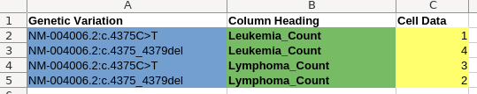
We shouldn’t have had to hand-craft that in SQL, taking time and creating a complex query with the potential to harbour bugs.
Spreadsheets aren’t (necessarily) tables
Pipelines to import data from spreadsheets into databases are often naive; the observation is made that spreadsheets are rectangular, and database tables are rectangular, so the assumption is made that spreadsheets can be considered as being just like a database table and imported through a simple translation of rows into records. The worse ones even assume there are no margins or titles, so every row is a record starting from the very top left of the spreadsheet.
But spreadsheets don’t have to be like that, and telling users they should be like that to appease the machine does a disservice to them. Spreadsheets are a tool for humans, and a spreadsheet with titles, comments, formatting, explanatory text, and laid out for readability and understandability, is a better spreadsheet than one that’s just a SQL table dumped into an Excel file.
However, often that data will need to be processed by a machine in some form; either to automate a task for that user that they can’t do themselves in Excel, or to put the data into some bespoke system that needs it. So the tools we use to import spreadsheets into databases should be able to deal with good spreadsheets, rather than forcing users to make them bad; the data pipeline we were using for the cancer data was a widespread industry standard one, not some poorly maintained bargain tool.
That’s why, here at Register Dynamics, we’re developing our own toolkit for building spreadsheet data import pipelines - and we’re conducting a study of public data in spreadsheets to see how data is structured in good spreadsheets, so we can build our tool to handle it.
Learn more about this toolkit:
Author
