
Data people hate spreadsheets… or do they?
“Blame the spreadsheets” is a bit of a meme amongst data practitioners. Whenever collecting and working with data from real people goes wrong, frustrated voices can be heard bemoaning the messiness of spreadsheets, and how APIs wouldn’t have this problem. We’ve certainly heard that opinion enough times from our decade of helping others with data problems!
It leads to people trying to put strict restrictions on spreadsheets, by imposing rules that mean they can’t have formatting, colours, blank spaces, notes, or multiple tables – all features that humans find helpful – in an effort to combat messiness and achieve data collection bliss. But analysis shows that this is not the majority of spreadsheets that most regular humans create, and when human-friendly spreadsheets hit these rules it’s often the user that’s left struggling to deal with it.
We’ve realised the real way to serendipitous data collection is to embrace the human-friendly mess, and to help the humans extract the value from their spreadsheet. But we’ve wondered: are we alone in thinking this? Do data practitioners really believe that spreadsheets are better off optimised for machine processing? How much is this popular conception impacted by the loudest voices in the room?
We asked people at our two favourite unconferences
We asked people at OpenDataCamp 2025 in Edinburgh and UKGovCamp 2026 in Birmingham using an in-person survey that we ran at our sponsorship stand. We had a few design principles:
As we’re not always at the stand (because we’re attending the excellent sessions instead, or volunteering to help run the conference!), we wanted the survey to be easy enough to understand without needing one of us to explain it.
We also knew that our survey would need to be simple enough to complete quickly, as attendees typically engage with our stand for a minute or less when they’re not directly talking to us.
Our final design principle was for our survey to be visual and tactile, so that people could notice it from across the room and would be curious to engage with it.
First question: understanding if the respondent is a data practitioner
We asked attendees two questions. The first was to gauge how much they were a ‘data practitioner’. After some deliberation, we ended up asking “how confident are you with data?” We picked this deliberately vague question because defining a data practitioner succinctly and in an inclusive way is hard – we didn’t want to deliberately bias against people without technical skills, for example, as that would exclude highly numerate and analytical people like statisticians.
Our choice was thus to ask something that was designed to be answered by a user’s own interpretation. We observed that people were initially put off by the vagueness but did ultimately feel happy to answer the question.
Attendees were able to rank their confidence using a six point scale. We picked a scale rather than a binary yes/no response to overcome the imposter syndrome that people feel when assessing their data literacy. We used a six point scale because this even number would be easily divisible into two or three buckets later if we wanted to analyse the answers in aggregate.
Respondents gave their answer by picking a coloured popsicle stick from a rainbow colour range, with red being least confident and violet being most confident. We didn’t show numbers against the colours, and just indicated the meaning at both ends of the spectrum. We used popsicle sticks instead of plastic counters because they're compostable and low carbon.
Second question: what are spreadsheets for?
Our second question tested the respondent's view on spreadsheets. Our past analysis has shown that spreadsheets are split broadly into two camps: those that have flexible structure, visual features and semantic formatting to help humans communicate and keep track of information, and those that are rigidly structured and devoid of formatting to be more easily machine-processable.
Instead of trying to explain this distinction in a survey question (and not assuming that everyone has read our earlier work!), we focused on expressing the more simply explained concept of purpose. We asked the question “What are spreadsheets for?” with two possible answers: “For humans to communicate with each other” and “For machines to process and receive data”. Respondents posted their stick from the first question into one of two jars next to each possible answer.
Some people didn’t agree that it's a binary answer. One person put their stick in the middle in protest, and another person used two sticks. Our analysis certainly disagrees for a single sheet as there appear to be two distinct purposes, but it's not untrue that spreadsheets of both types exist!
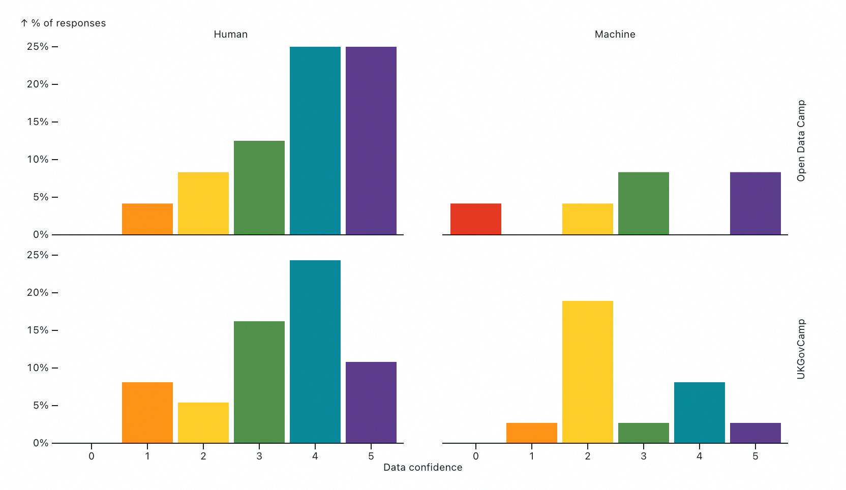
We got 61 responses overall, with 24 from OpenDataCamp and 37 from UKGovCamp. The response count means we got about a quarter of people attending each unconference to respond.
Sense check: did self reported data confidence vary per conference?
We ran the survey at both conferences as a sense check of our question about data practitioners. As OpenDataCamp is tighter in scope to unconference sessions about data, we hypothesised that our first question would be successful if we could see a higher level of reported confidence there compared to UKGovCamp. (Not to say that data practitioners don’t go to UKGovCamp – after all, we were there! – but just that they would be more dilute.)
We do broadly observe the expected correlation – respondents from OpenDataCamp generally reported themselves to be at a higher level of confidence with data than at UKGovCamp, with 79% of OpenDataCamp respondents choosing one of the three highest levels compared to just 65% at UKGovCamp.
Main result: is the answer correlated with being a data practitioner?
It’s a wonderful result! We found the opposite to what we expected. It turns out that data practitioners do see spreadsheets as human-centric tools rather than as something that should be optimised for machines. The prevalence of that view broadly increases with increasing data confidence, too, so that data practitioners are more likely to see spreadsheets as a human tool than non-practitioners.
Our initial hypothesis didn’t come out of nowhere, though. We have observed in the real world that lots of people who are involved with data work think that spreadsheets should always be rigid and easy to machine-process, and that it’s a major design problem for user-centered services.
One effect that we may be seeing is that our segmentation of ‘data practitioners’ isn’t granular enough. Data practitioners have a multitude of skills, including numeracy, data literacy and technical literacy, and most practitioners are stronger in one or two skills than the others. Our next hypothesis is that the practitioners that advocate for machine-optimised spreadsheets are more technically literate. We could do with finding a more technical cohort to test with – but we might need to look outside of our favourite unconferences, as our results may indicate that these people are under-represented in the attendees.
In any case, it’s very positive and motivating to know that there is a segment of confident data practitioners that recognise our core message: spreadsheets designed by humans are for humans to consume, and trying to machine process them is something that digital services need help with!
Author

Tags